Gegor fonts from Balibilly Design - (uhrzz)

Gegor
Gegor GegorGegor


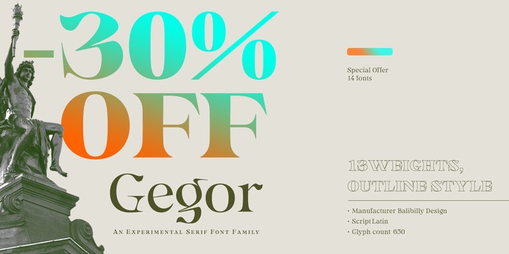
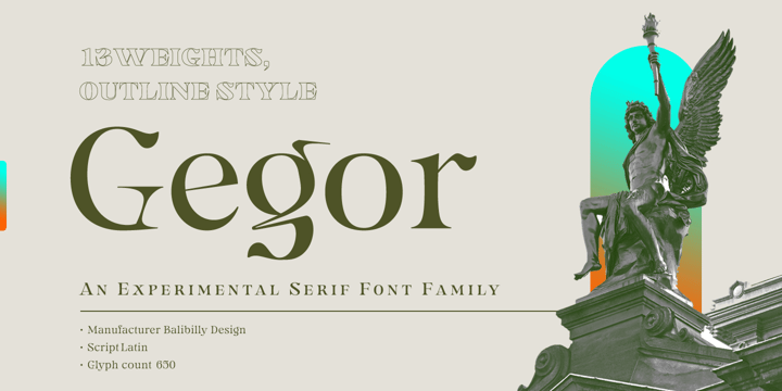
Say Hello to Gegor, an experimental serif display font.


Gegor is freedom of our hand when creating the letterform without many references. We try to let the pen tool flow and dancing according to our imagination. The characters of this typeface are adopted from the letter "r". She was born and influence each other. The simple shape on the shoulder are slightly pointy at a thick weight and curves at a thin weight have a big influence on other letters. The unique form of letter "r" takes us to further development to get achieve a distinct harmony as a display typefaces.


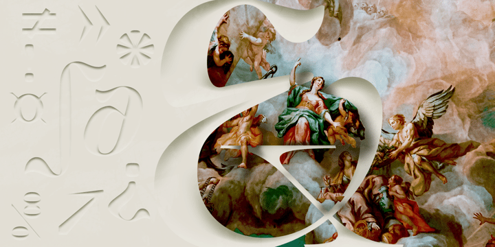
If you look at the teaser images and get an idea, we are in line. 

Gegor consists of 14 families from thin to black, and 1 outline style in black weight equipped with discretionary ligatures, case-sensitive forms, ordinals, small capital, and fractions. Consists of multilingual support including Western European, Central European, and Southeastern European.


Gegor is perfect for posters, logos, branding, magazines, websites, and more. Gegor will give a unique vibe to your works.


Supports languages:

Afrikaans, Albanian, Asu, Basque, Bemba, Bena, Bosnian, Catalan, Cebuano, Chiga, Colognian, Cornish, Corsican, Croatian, Czech, Danish, Dutch, English, Estonian, Faroese, Filipino, Finnish, French, Friulian, Galician, Ganda, German, Gusii, Hungarian, Icelandic, Ido, Inari Sami, Indonesian, Interlingua, Irish, Italian, Javanese, Jju, Jola-Fonyi, Kabuverdianu, Kalaallisut, Kalenjin, Kinyarwanda, Kurdish, Latvian, Lithuanian, Lojban, Low German, Lower Sorbian, Luo, Luxembourgish, Luyia, Machame, Makhuwa-Meetto, Makonde, Malagasy, Malay, Maltese, Manx, Maori, Morisyen, North Ndebele, Northern Sami, Northern Sotho, Norwegian Bokmål, Norwegian Nynorsk, Nyanja, Nyankole, Occitan, Oromo, Polish, Portuguese, Romanian, Romansh, Rombo, Rundi, Rwa, Samburu, Sango, Sangu, Sardinian, Scottish Gaelic, Sena, Shambala, Shona, Slovak, Slovenian, Soga, Somali, South Ndebele, Southern Sotho, Spanish, Swahili, Swati, Swedish, Swiss German, Taita, Taroko, Teso, Tsonga, Tswana, Turkish, Turkmen, Upper Sorbian, Vunjo, Walloon, Welsh, Western Frisian, Wolof, Xhosa, Zulu


Popular posts from this blog

Download Winslow Title Fonts Family From Kimmy Design

Download Winslow Title Fonts Family From Kimmy Design Winslow Title is a high contrast modern type family comes in two styles and a monolinear script family. The traditional proportions of Winslow Title are historical in nature and follow the design and style of Winslow Book as a high contrast variant. The Winslow Title Mod family is a contemporary take on the style, with tapering terminals and less pronounced finials. Each family includes both styles, to be accessed through the opentype panel as a stylistic alternate. If preferable, you can purchase the entire family collection to have easier access to both styles, but it's not necessary. The typeface family comprises of roman and italic styles in six weights from Thin to Black and two widths in the roman style: Regular and Narrow. The accompanying script family has a single weight but offers five tracking widths, from Narrow to Wide.  The bundle is an elegant combination of styles perfect for titling and ...

[mhirqtzpno] Download Lust Text Fonts Family From Positype

Download Now Server 1 Download Now Server 3 Download Now Server 2 Yes, finally. This one took the most time and the most restarting. Years went into imagining what Lust Text should look like and how it should structurally behave in order to truly improve upon a setting that includes any of the Lust typefaces. I approached it as much from the side of the type designer, as I did a potential user. The flow, the warmth, the personality needed to be there, but all of the excess had to be removed responsibly. In the process, and in need of inspiration, I looked backward to historical artifacts and precedent. In each early Lust Text approach, the solution was lackluster and/or vanilla and not actually a ‘Lust’ typeface. The exercise was not in vain though. By exploring past examples, I found my footing drawing for media now and how it might be used later—all the while, ...

Download Glance Slab Fonts Family From Moritz Kleinsorge

Download Now Server 1 Download Now Server 2 Download Now Server 3 Many good things such as X-rays, penicillin and water ice were discovered accidentally. And now Glance Slab completes the list. To complete his type library, type designer Moritz Kleinsorge designed a new Slab Serif, but he was not happy with his first design at all. So he started experimenting with certain shapes and by accident the shoulder of the lowercase letter /n was suddenly no longer connected to the stem anymore. He liked this accidental discovery so much that he took this feature and created a complete typeface out of it - without receiving a stencil typeface, because he sees the unconnected elements more as an ink trap than as a stencil element.  The result is a dynamic and sporty, yet organic slab serif. The typeface is characterized by the previously described unconnected elements in letters where a curve meets a stem. Especially the letters (/a, /c, /s, /C, /G, /J, /S as well as some numbers and symbo...